GEOG5870/1M: Web-based GIS A course on web-based mapping
CSS is the mechanism by which web pages are consistently styled. Essentially, a style-sheet is created that handles the look and feel of your webpage. We will look at a couple of examples here.
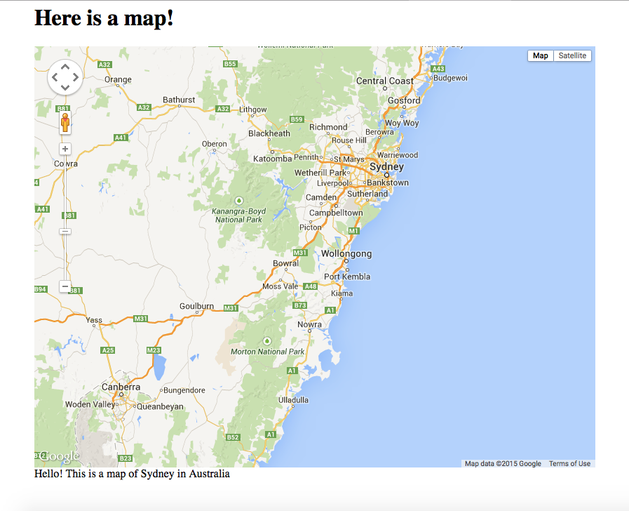
- Fixed Map Size, Centered to the page: Map is a fixed size and centered to the page, allowing for title and description text to go above and below it.
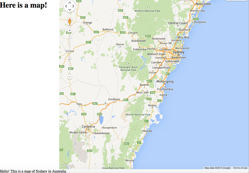
- Two column layout: Add a side panel to the left of the map, and have the map occupy the remainder of the space allowed by the browser window.
We will use this file (that you played with in Unit 2) to play around with CSS.
Currently, the "style" is set to 100% for the width and the height.
<body onload="initialize()">

<div id="map_canvas" style="width:100%; height:100%;"></div>

</body>
<body onload="initialize()">

<div id="map_canvas" style="width:800px; height:600px;"></div>

</body>
<body onload="initialize()">

<h1>Here is a map!</h1>

<div id="map_canvas" style="width:800px; height:600px;"></div>

</body>
Centering your elements
You will notice that the 2 elements of the page, the h1 and div, are both aligned to the left of the page. In most websites, it has become common practice to have the contents inside of a div that is centered on the page, rather than having it left-aligned. To do so, let’s create a div container for all the elements of the page to go in, and make sure that the container is centered to the page:
<body onload="initialize()">

<!-- container that is centred on the page for site content -->
<div style="width:800px; margin:auto;"></div>

<h1>Here is a map!</h1>

<div id="map_canvas" style="width:800px; height:600px;"></div>

<div>Hello! This is a map of Sydney in Australia</div>

</body>

Column Map Scenario
In this scenario, we want to maximise the size of the map and create a small panel to the left of the map. To do so, create a sidepanel div container before the map div. Let’s assume that we want our sidepanel to occupy 250 pixels, and the map to occupy the remainder space allowed by the browser window. First, create the side panel div, with some content in it (in this case, some title text):
<body onload="initialize()">

<!-- side panel div container -->
<div style="position:absolute; width:230px; height:100%; overflow:auto;">

<h1>Here is a map!</h1>

</div>

</body>
- position:absolute; This ensures that the div's position is set to the parameters you specify
- overflow:auto; This makes sure that if your content inside this container exceeds the height space allocated, that a scrollbar will show up allowing users to scroll down
- float:left;This ensures that the div is aligned to the left
Notice that although we want the width to be 250 pixels, it is set at 230 pixels. Why is that? Also notice that there is a stylesheet parameter for "padding-left" and "padding-right", each set at 10 pixels. The padding allows you to have some white space within the div to allow any text that you put in it, to have some breathing room, and not be placed flush against the left margin of the div. But combined, it takes up 20 pixels, and therefore, you must substract those 20 pixels from the total width (ie: 250 pixels - 30 pixels = 230 pixels).
Now we needs to modify the map div slightly to ensure that it works well with the sidepanel div:
<body onload="initialize()">

<!-- side panel div container -->
<div style="position:absolute; width:230px; height:100%; overflow:auto;">

<h1>Here is a map!</h1>

</div>

<div id="map_canvas" style="height:100%; margin-left:250px;"></div>

<div>Hello! This is a map of Sydney in Australia</div>

</body>
- margin-left:250px; The margin size here must be set to the pixel count from the left of the browser window that you want the map div to start from. It will then render the div to the right of the given pixel space.
And finally
Putting it all together should produce a side panel on the left, with a map on the right that occupies the remainder space for the browser window.
